UI/UX Redesign of Marine Visualization & Entry Workflows
🐚 UI/UX Redesign of Marine Visualization & Entry Workflows
Client Sector: Marine Conservation & Research
Client: University of Guam Marine Lab & Micronesia Coral Reef Monitoring Network
Service Type: Full-Stack System Modernization
Technologies Used: React, Django, R Shiny, Angular, Python, Pandas, Numpy, Scipy
🔗 Explore more blog posts from the Micronesia Reef Monitoring series here
🧠 Background
We merged two distinct tools—a marine data visualization app (Angular) and a data entry interface (R Shiny)—into a single, responsive React SPA. This overhaul was not just technical: it required careful UI/UX architecture to support scientists and environmental researchers who work with large datasets under challenging field conditions.
In our previous case study, we highlighted the UI/UX enhancements and performance upgrades that shaped the final platform. This post details the challenges, technical solutions, and UX principles that guided our redesign.
🧹 Challenges in Merging Interfaces
- Fragmented workflows between data input and analysis
- Poor performance under heavy data loads
- No mobile responsiveness
- No offline-friendly workflows
🔍 Performance & UX Enhancements
📅 Lazy Loading with React.lazy
To reduce bundle size and improve load time, we lazy-loaded heavy components like advanced charts:
const ReefScoresConditionScore = lazy(() => import("@/components/..."));

<Suspense fallback={<ReefScoresSkeleton />}>
  <ReefScoresConditionScore {...props} />
</Suspense>;
This improves time-to-interactive, especially on lower-powered devices.
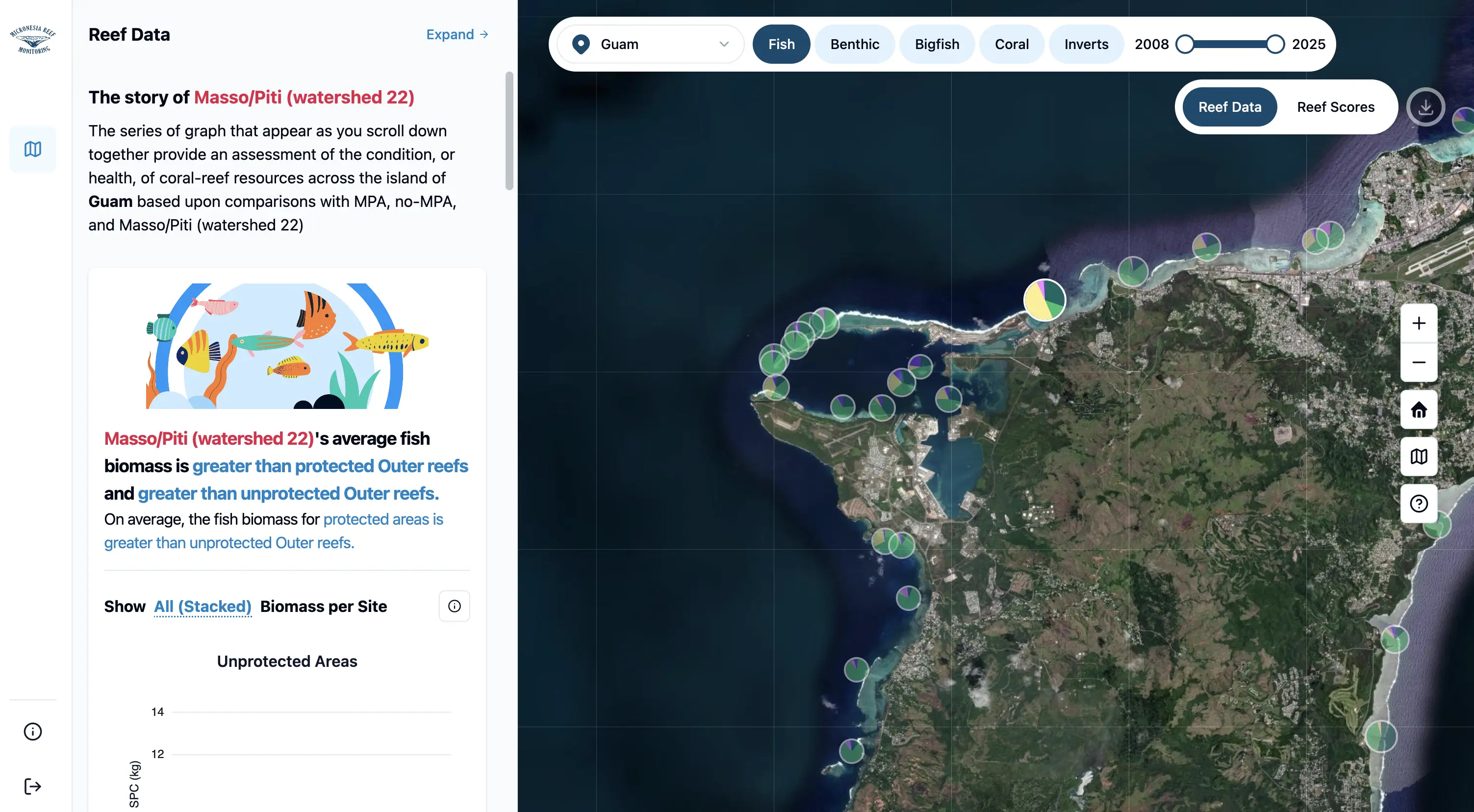
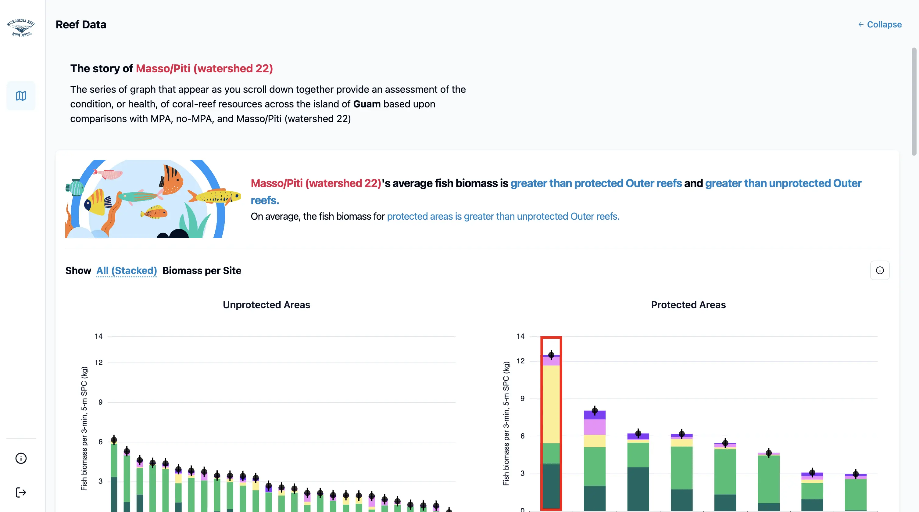
🧽 Expandable Layouts with Shadcn Sidebar
We implemented a resizable, side-by-side layout using Shadcn’s Sheet component, paired with a toggle button that allows users to expand or collapse the sidebar. This layout supports two key workflows:
- Side-by-side view for interactive exploration—comparing visualized data with nearby site distributions.
- Expanded view for focused, detailed inspection of individual charts or datasets.
<Button onClick={() => setExpanded(!expanded)}>
  {expanded ? "Collapse" : "Expand"}
</Button>
Here’s how it works in practice:
- Collapsed Sidebar: Users can simultaneously view a chart on the left and compare it with other site data from the same island on the right. They can click
Expandon the top right of the sidebar to expand it.
- Expanded View: Users can maximize the chart area for a clearer, distraction-free visualization experience.They can click
Collaspeto collapse the sidebar.
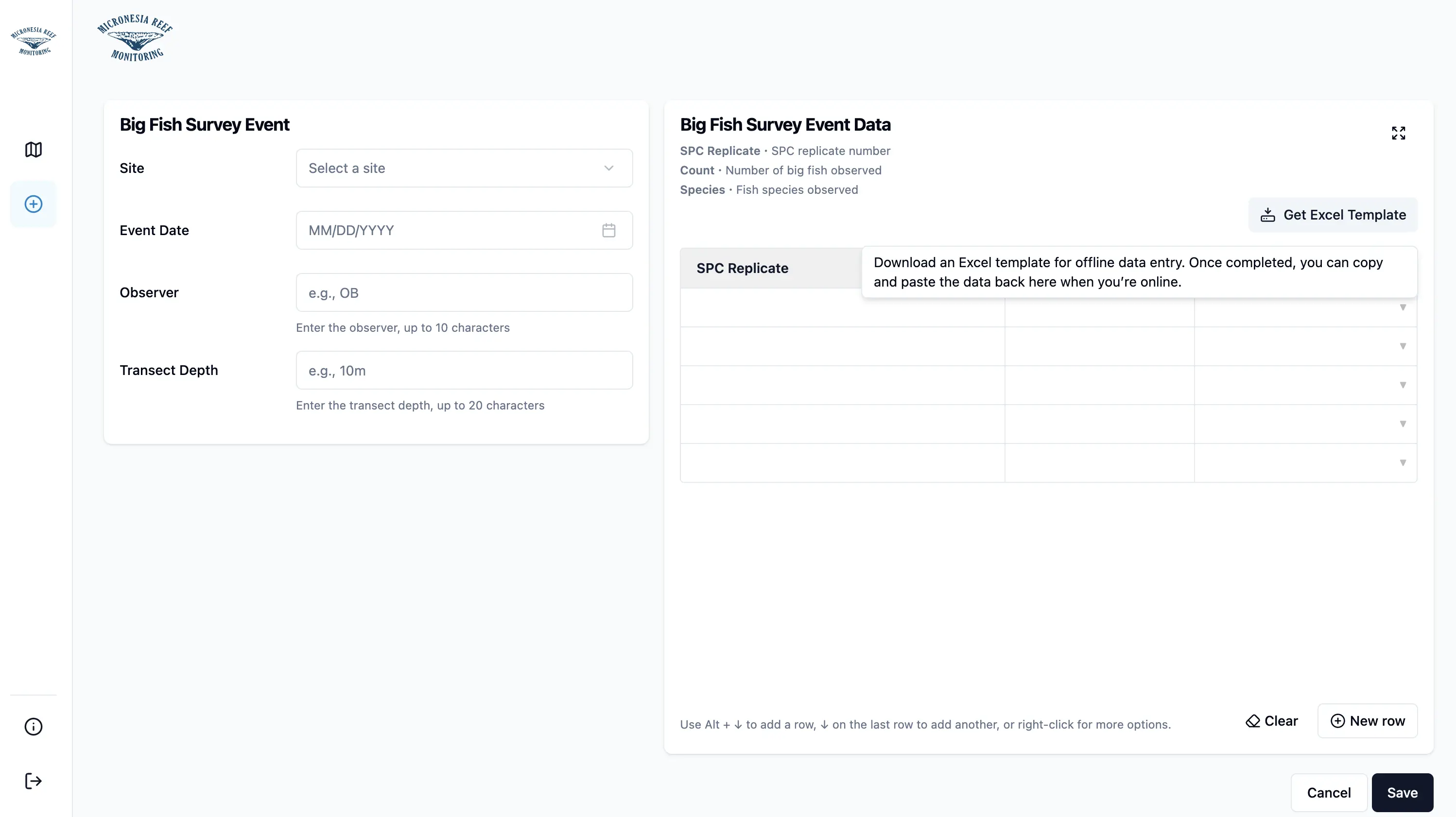
📄 Offline Data Entry with Template Upload
To support researchers working in areas without reliable internet, we added a feature to download Excel templates for offline data entry. Users can fill these templates in tools like Excel, then paste the data back into the platform once they’re online.
🐟 Example: Bigfish Survey Template
The following button lets users download a pre-formatted .xlsx file containing fields like:
- SPC Replicate
- Count
- Species Name (with validation based on available species list)
<DownloadExcelButton
  download={() =>
    downloadExcelTemplate(
      [
        { key: "spc_rep", colName: "SPC Replicate" },
        { key: "count", colName: "Count" },
        {
          key: "speciesName",
          colName: "Species Name",
          validation: fishSpecies.map((specie) => specie.name),
        },
      ],
      "big-fish-survey-event-data-template",
    )
  }
/>
🧭 Tooltip for In-Context Guidance
We enhanced the user experience by adding a tooltip to the button. When users hover over it, they receive helpful instructions for using the template.
<Tooltip>
  <TooltipTrigger asChild>
    <Button onClick={download}>Get Excel File</Button>
  </TooltipTrigger>
  <TooltipContent side="bottom" align="end">
    Download an Excel template for offline data entry. Once completed, you can
    copy and paste the data back here when you're online.
  </TooltipContent>
</Tooltip>
🖼️ What It Looks Like Here’s what the UI looks like in action:
This feature makes it easy for field teams to collect data using familiar tools and ensures they can smoothly transition back into the digital workflow when connectivity is restored.
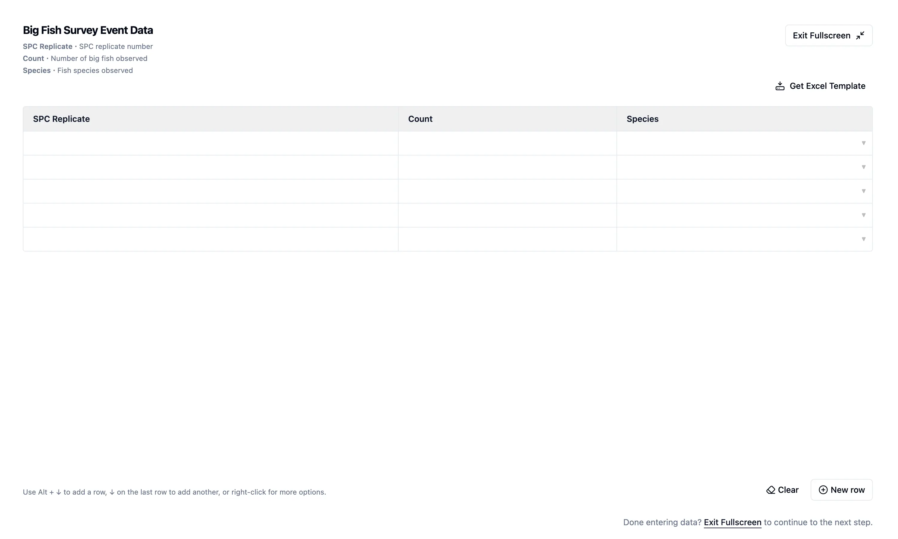
🖥️ Fullscreen Mode for Data Entry Tables (Idea by Dr. Peter Houk, Principal Investigator at the UOG Marine Lab and Micronesia Coral Reef Monitoring Network)
To make better use of available screen space, we introduced a fullscreen mode for survey tables. Since the right-hand table contains significantly more data than the left-hand survey form, expanding it helps researchers view and input data more efficiently.
We manage fullscreen state using the fscreen library and a simple toggle button:
const handle = useFullScreenHandle();

{
  handle.active ? (
    <CloseFullscreenButton onClick={handle.exit} />
  ) : (
    <ExpandFullscreenButton onClick={handle.enter} />
  );
}
To improve discoverability, we also wrapped the button with a tooltip to indicate its purpose.
🔘 Fullscreen Button with Tooltip

🧭 In Fullscreen Mode
Once activated, the button label (on the top right) changes to Exit Fullscreen, and a short instruction appears in the bottom right to guide users on how to exit.
🪪 Form Validation with Zod + React Hook Form
We defined schemas with Zod and bound them to forms using React Hook Form:
const schema = z.object({
  username: z.string().min(1),
  password: z.string().min(1),
});
const form = useForm({ resolver: zodResolver(schema) });
This provides type-safe, real-time validation and reduces form bugs.
🌏 Responsive Layouts via Tailwind
We used Tailwind's utility classes to build responsive grid layouts:
<div className="grid grid-cols-1 gap-4 md:grid-cols-2">
  <DataEntryForm />
  <LivePreview />
</div>
This ensures a smooth experience on mobile, tablet, and desktop.
🧪 Best Practices for Scientific UI/UX
- Use code-splitting to reduce initial load
- Enable offline workflows with template-based entry
- Provide layout flexibility for different screen types
- Surface context with charts, tooltips, and in-place help
- Validate early with schema-based inputs
- Involve stakeholders (like Dr. Peter Houk) early and often
🚀 Before & After Impact
Our redesign led to major improvements across the platform:
-
Validation: Previously, users only saw validation errors after submitting forms. Now, with Zod and React Hook Form, they receive real-time feedback while filling out data.
-
Visualization: The original system relied on static, reload-heavy graphs. We've replaced them with dynamic, lazy-loaded ECharts that support smooth interaction and rendering.
-
Mobile Support: The legacy tools were optimized only for desktop. With responsive Tailwind CSS, the new UI adapts seamlessly to tablets and smaller devices.
-
Data Entry: Data had to be entered manually and online. We now support offline-friendly workflows through downloadable Excel templates and paste-to-table functionality.
-
Navigation: Users had to jump between siloed tabs. The new layout supports expandable, resizable side-by-side panels for better multitasking and data exploration.
-
Full-Screen Mode: Added fullscreen mode for the right-hand table in data entry to better utilize space and display more data.
📌 Conclusion
Our React SPA redesign modernized not just code, but the user experience—tailoring it for scientists, field workers, and marine data stakeholders.
Through smart tooling, schema validation, responsive UI, and collaboration with users like Dr. Peter Houk, we created a platform that's truly ready for both lab desks and reef sites alike.
📚 Read the full backstory of Micronesia Reef Monitoring.
🚀 Ready to modernize your data-driven platform? Let’s build something together.